BACKGROUND
Regardless of your fitness level, background, age or need for modification, you are welcome here! Come as you are and begin or continue your fitness journey with us! You’ll continuously be challenged and encouraged while advancing at your own pace. You’ll be sure to meet and exceed your goals as long as you’re willing to push just 1MoreRep!

CHALLENGE
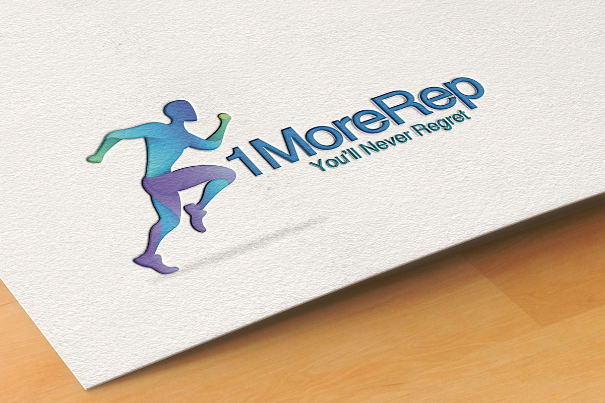
Logo redesign and branded items for 1MedRep. They made a request for the redesign of the already existing sign. The client set the task to renovate the logo since it looked old, plain and weak with a poor color palette. A new brand sign was expected to modernize the appearance of the current business profile so that it could correspond to the peculiarities of the target audience.

SOLUTION
It started with the brainstorming and analyzing client’s vision of a new symbol. As they wanted the modernization, a new brand sign was expected to be more playful and fresh still simple with abstract elements. In addition, the client asked to keep blue color palette as it corresponds to their vision of the brand image.

RESULT
The color palette was chosen according to the clients’ expectations. Light blue color gave the feeling of stability and the slight gradient made the logo more playful and modern-looking which responded to a current brand strategy.


