CHALLENGE
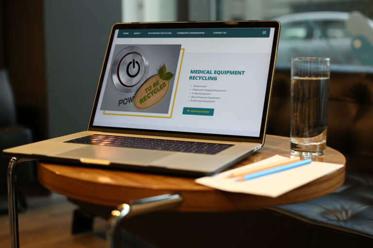
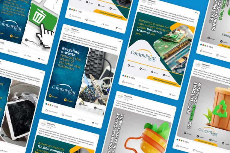
CompuPoint USA, LLC was with us since 2011. With an outdated design and platform, an electronics recycling company needed a new website. While approaching the redesign, we noticed their branding was designed by us a decade ago, we improved that little bit to stood out.
Then, during design meetings, owner Khuzaima Dohadwala showed us the witty, friendly personality of himself and his business. He even suggested offhand having a “professional but lively” voice for the new website. We loved the idea.
Most importantly, they needed live counters that calculates recycled products in different units in real time.

SOLUTION
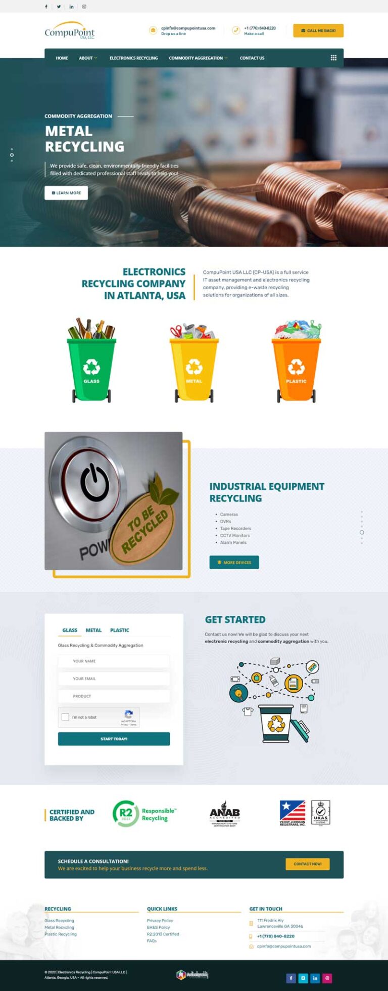
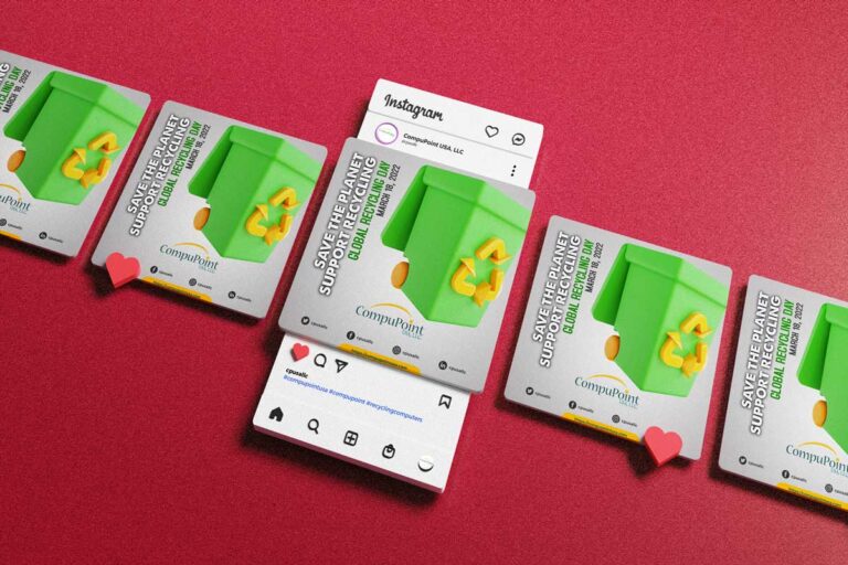
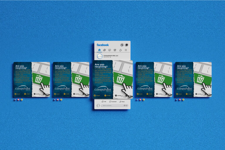
We leaned into the teal and yellow, which feel fresh and welcoming. With aqua accents and new typography are youthful and modern, which evoke their ambitions to transform CompuPoint USA with newer, better imaging branding. A moving point depicts the recycling, and reuse objective of the brand. With same color combinations we design and developed the website and outcome is in front of us.
We formulated plugin for counters on specific pages that calculate recycled products by them in real time.

RESULT
CompuPoint USA, LLC now has a brand and website that is both unique to many businesses online and certainly one that stands out in the recycling industry. Their voice carries a professional yet confident tone and their colors prominently show off their brand for both industries and companies.
#1 - Google
1st Page - Google
2nd Page - Google
What they said....
Positive: Professionalism, Quality, Responsiveness, Value.


